Visualizing DINAMITE traces with execution flow diagrams
20 Dec 2016In this post we introduce DINAMITE’s execution flow charts – charts that visually convey both how the program works and how it performs.
Our previous post described how to parse binary traces created in the process of running the DINAMITE-instrumented program. The parsing step will convert the binary traces to text, create summary files, and generate execution flow charts showing how the program transitions between different functions and how much time it spends there.
The process-logs.py script in the binary trace toolkit (see
previous
post)
will now produce a directory called HTML in the same directory where
you ran the script. By opening HTML/index.html inside your browser,
you will see execution flow charts for all threads on a single page
and clicking on any image takes you to a new page, where this image is
interactive: you can click on rectangles corresponding to different
functions to get summaries of their execution. Let us go through all
of this in more detail.
First, let’s take another look at an execution flow chart. The one below is for one of the application threads in a a multi-table workload executing on top of the WiredTiger key-value store.
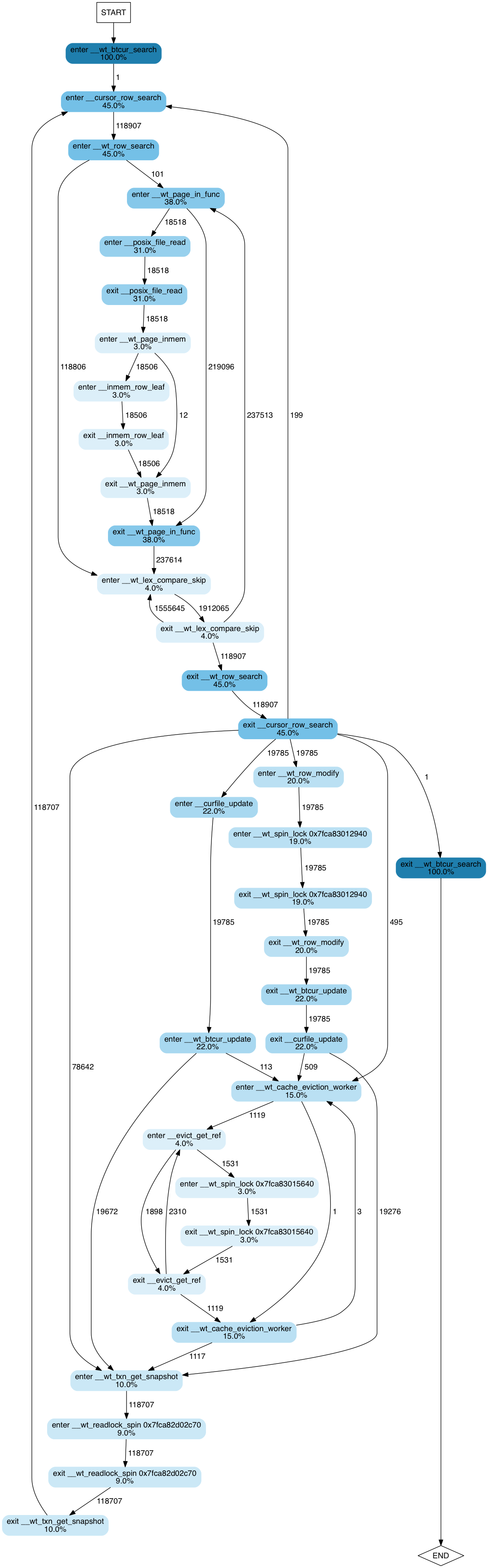
The image shows a state transition diagram, where states are function entry/exit points. Edges between states show how many times each transition occurs. Nodes corresponding to states are coloured and annotated accordingly to percent of execution time spent by this thread in the corresponding function. Percent values are cumulative. That is, if foo() took 100% of the execution, and bar(), called by foo(), took 90%, they will be annotated as 100% and 90% respectively.
From this diagram we can intuit how the program works, even if we have
never seen the code and have only a vague understanding of how
key-value stores work. We observe that it searches a btree (100% of
the time is spent in __wt_btcur_search), which probably has a
row-based layout (__wt_row_search, __cursor_row+search). We can
guess that in this execution the thread performed 118,907 searches
(the number of transitions between enter __cursor_row_search and
enter __wt_row_search) and of those searches most of the records
(118,806, to be precise) were found in memory: we can guess the latter
from the fact that there are 118,806 transitions directly from enter
__wt_row_search to enter __wt_lex_compare_skip. 110 of the
searches, on the other hand, did not find the needed page in memory
and caused the system to read the data from disk: hence the right
subtree emanating from the enter __wt_row_search function and
dominated by __wt_page_in_func (38% of the execution time) – the
function that, judging by its name, pages the data from disk.
Furthermore, we get interesting statistics about the effect of locks on performance.
- ~19% of the time is spent waiting on a spinlock somewhere in
__wt_row_modifyfunction (or its children). - A lock acquired by
__evict_get_reftakes about 3% of the execution time - There is also a read/write spinlock, acquired by
__wt_txn_get_snapshot(or its children) — it takes about 9% of the execution time for this thread.
Note that lock releases are not shown here, because they take less than 2% of the execution time, and by default the trace-processing script filters any functions with small contributions to the overall time to avoid having to show a huge number of nodes.
Now, if you follow this link, you will be taken to a page that includes interactive version of execution flow charts for all threads for the same workload.
If you click on any image, you will be taken to a page where the same image is interactive. You can click on any node of the flow diagram and be taken to a page containing a short summary of this function’s execution. Those summaries are not great yet; we are working on making them more useful, but one curious thing we discover from them, by clicking on a summary for any lock-acquiring function, is that the largest time to acquire a lock was more than a whole second (!!!) – much larger than the average time to acquire the lock. This is definitely a red flag that a performance engineer would want to investigate.
For another example, take a look at the following execution flow
charts for RocksDB. We executed dbbench with the multireadrandom
workload using
one,
two,
four
and
eight
threads respectively. Note how the time spent acquiring locks
increases as we increase the number of threads.
Note: If you have already converted binary traces to text and want to re-generate the HTML, simply go into the directory containing text traces and run:
% $DINAMITE_BINTRACE_TOOLKIT/process_logs.py trace.bin.*.txt
By default, all functions taking less than 2% of the execution time will not be included in the diagrams. To remove this filter, run the script like this:
% $DINAMITE_BINTRACE_TOOLKIT/process_logs.py -p 0.0
   trace.bin.*.txt
The -p argument controls the percent value for the filter. Without
filtering, the diagrams may become very large and not suitable for
viewing.
See previous post if you need information on how to download the DINAMITE binary trace toolkit.